
Repairing Broken Budgets
I joined Cleo's team in August 2021 to improve the app's budgeting tool. After immersing myself in the current product experience I began to identify opportunities for improvement and worked with the team to prioritise the order in which they should be tackled.
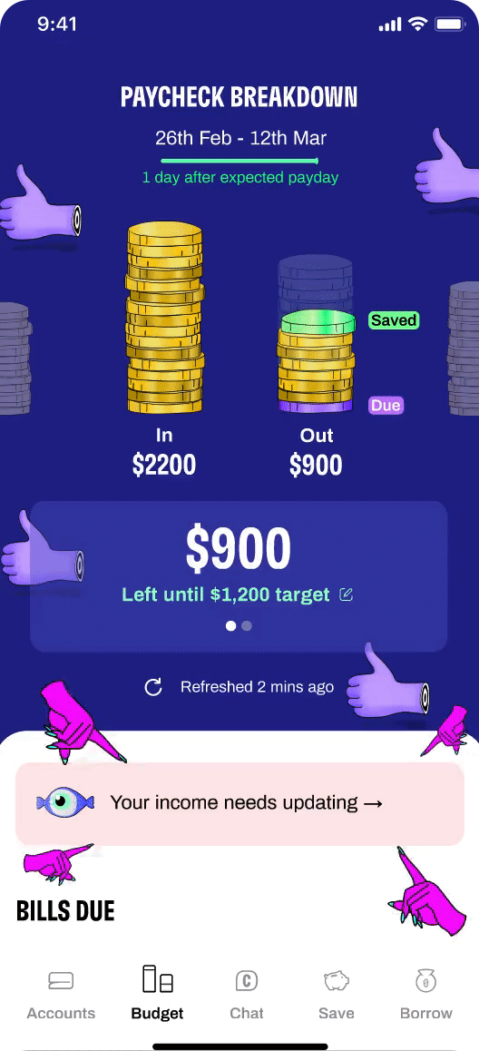
The most pressing challenge was finding a solution to a problem that affected nearly 20% of budget users each month - unmatched incomes.
What is it?
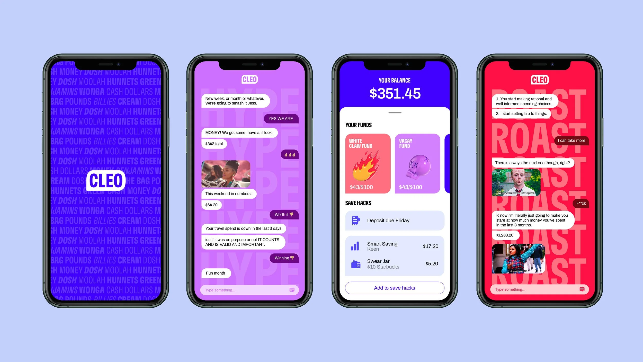
Cleo is a super-intelligent money app. Every day, she motivates people to improve their money health, empowering them to reach their goals without jargon or bullsh*t.
Having started life as a Facebook messenger chatbot, tone of voice is a critical part of what makes Cleo stand out. Described internally as ‘big sis energy’, her mix of real support and witty, no-nonsense speak means chat is still central in the product experience.
The problem
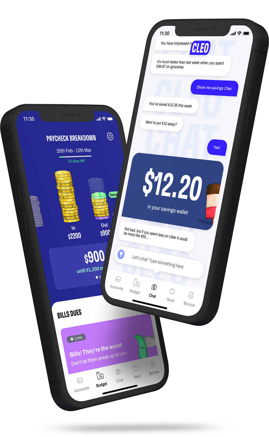
When a user sets up their budget they give Cleo some details about how they get paid so that she can track what the they have coming in and out. But if the pay date or the pay amount change then it would often not be tagged properly, essentially breaking the users budget. It would stay in this state until a user clicked a banner and took the necessary steps to re-tag their pay-check.
I started with an audit of the current UX, which highlighted three problems:
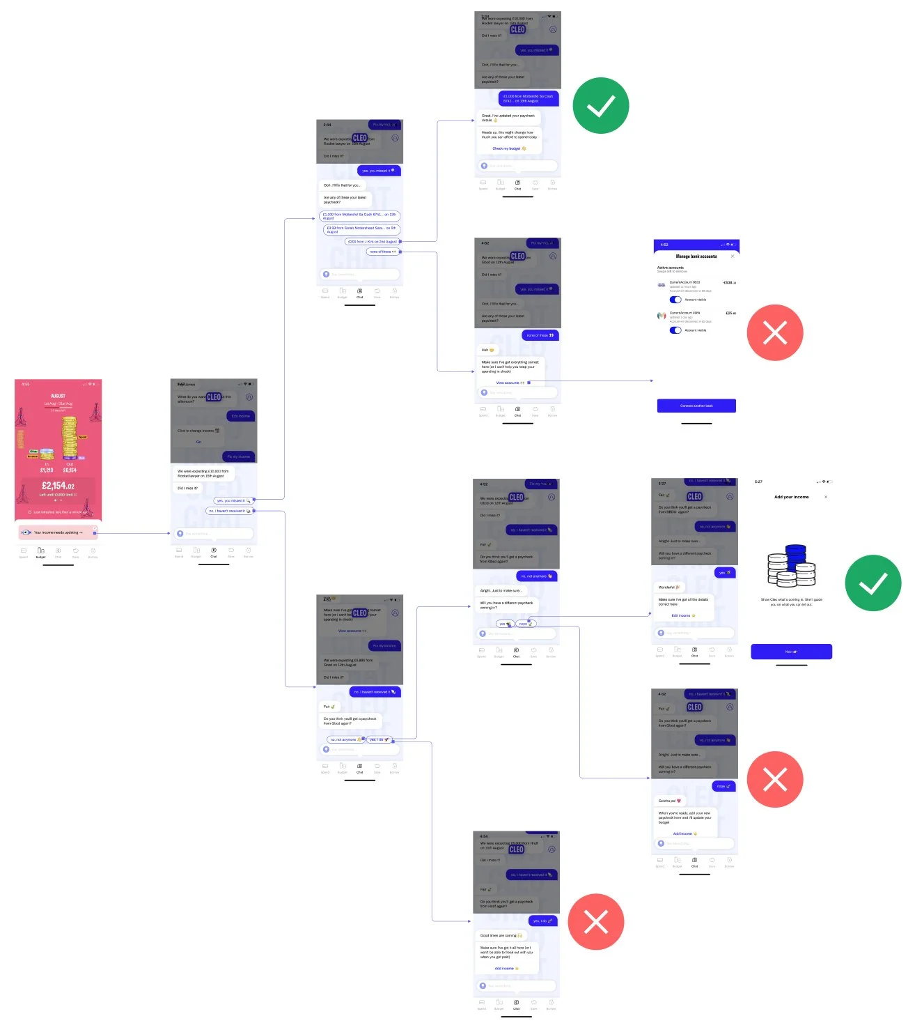
The current experience relied on the user interacting with the banner. If they missed / ignored it then their budget remained broken.
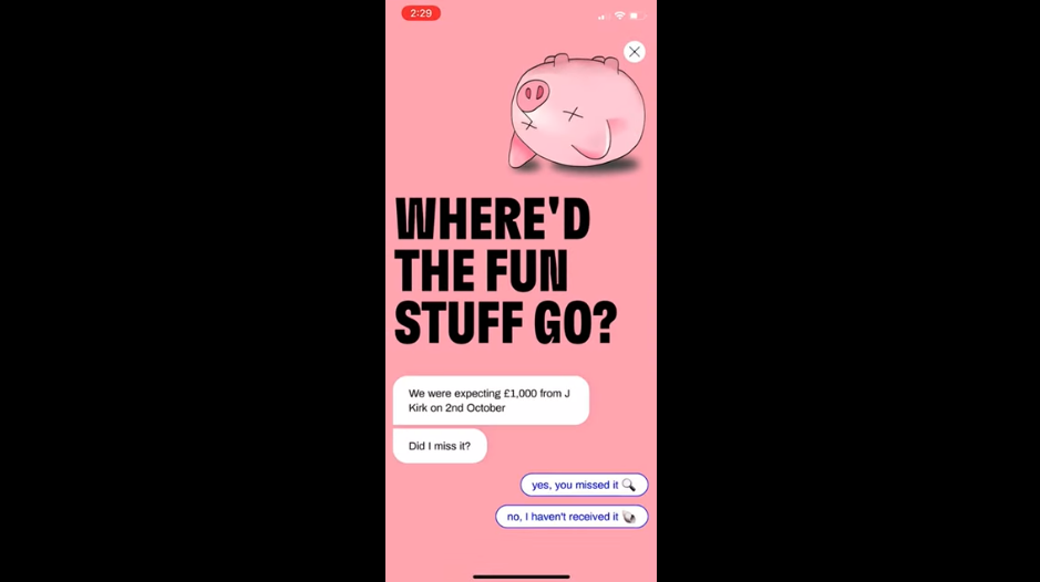
If the user did click on the banner then Cleo took them into the chat tab to fix the issue. This took them away from the their intended destination - their budget.
A number of the current flows created dead ends, leaving the user to figure out what their next step should be.
Adding positive friction
Instead of passively waiting for the user to find and click on the banner, I wanted to devise a more proactive UX that would automatically fire when they landed on the budget tab. Great UX design is about guiding users to make the right decisions, and in this case introducing a friction point forced attention and engagement (after all, their budget was broken until this problem was fixed). The question was how much friction needed to be added.
In order to explore this challenge, I created a series of banner treatments with varying degrees of friction. To quantify this metric (with a dash of Cleo personality) I created an eyeball rating scale.
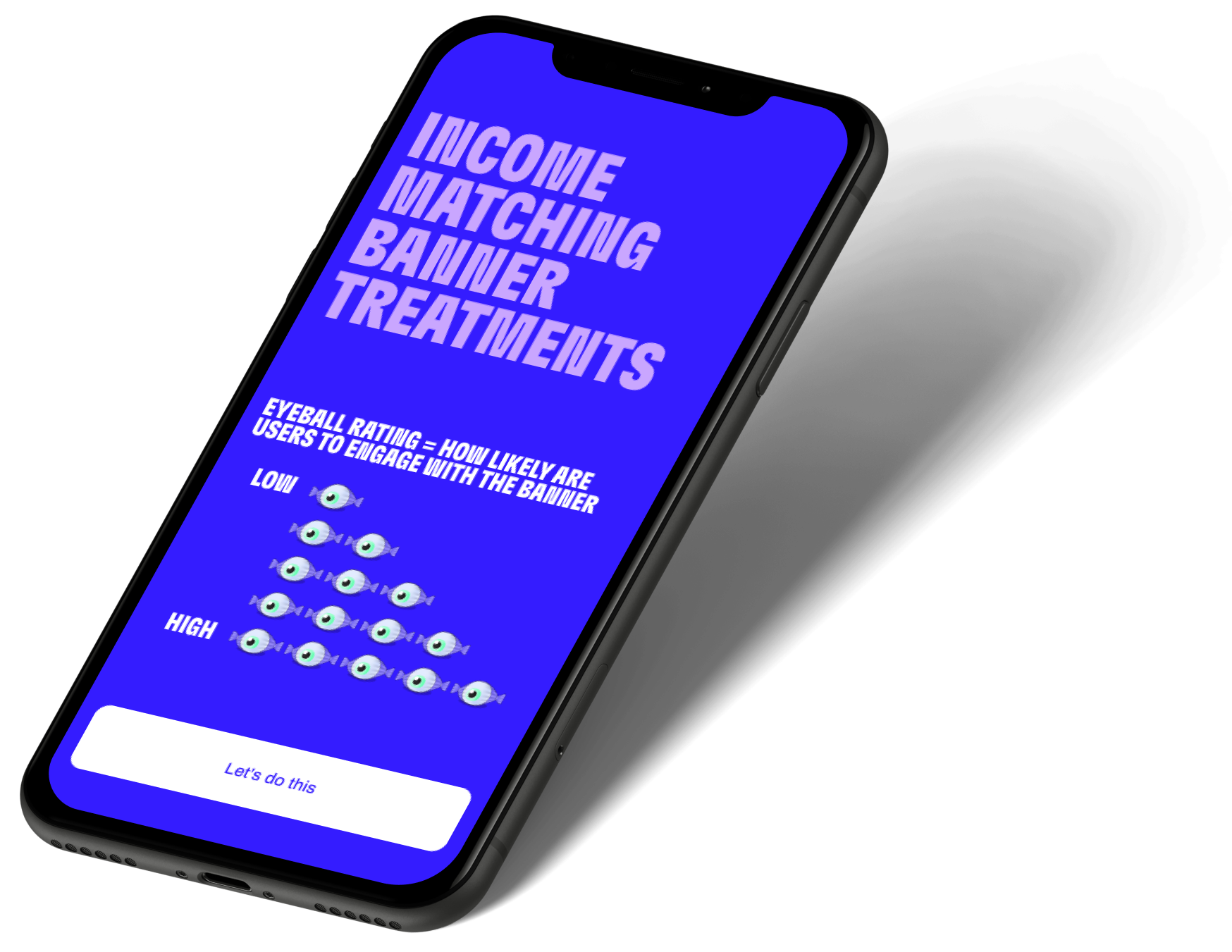

Rating = 1 eyeball

Rating = 1 eyeball
Rating = 2 eyeballs
Rating = 3 eyeballs
Rating = 4 eyeballs

Rating = 5 eyeballs
Taking the chat out of chat
User testing of banner treatments proved that a full page takeover was the most effective UX solution - maximum eyeballs! This created an interesting idea; could we bring the chat functionality into this full screen takeover, rather than taking the user to the chat tab?
After a few experiments it turned out that we could, and it tested really positively. Users loved the fact that it brought the Cleo personality into quite a boring task (re-tagging your pay check). They also really liked that it kept them within the budget tab, so when they had completed the task and dismissed the full page takeover they could continue exactly where they had left off.
Impact
After implementation this new UX saw a huge impact with more than a 200% increase in users fixing unmatched incomes, well above the expected KPIs for the project.
Furthermore, it paved the way for a new UX pattern that has been adopted by other parts of the product. Chat functionality (one of Cleo's most valuable assets) had never been used outside the chat tab before. Although there was some hesitation at first, the team loved how it could be used to inject Cleo's personality into boring flows and make them more interesting, exciting and engaging.