

Next-Gen E-Signatures for SMBs
Rocket Lawyer, founded in 2008, is a legal-tech platform devised to provide affordable and accessible legal services to all. At its heart lies a library of legal documents customisable through an online interview, with features such as consultations with real lawyers on offer.
Who it’s for
Nearly half of all revenue is contributed by the most valuable customer segment, SMB (small/medium business) owners. These customers utilize Rocket Lawyer extensively as a valuable business tool, generating, sharing, and storing multiple documents each month.
How I helped
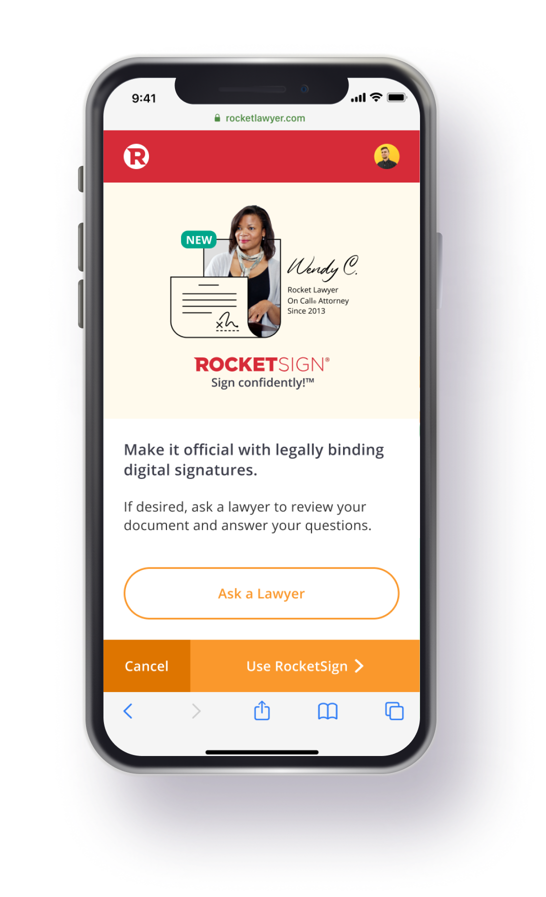
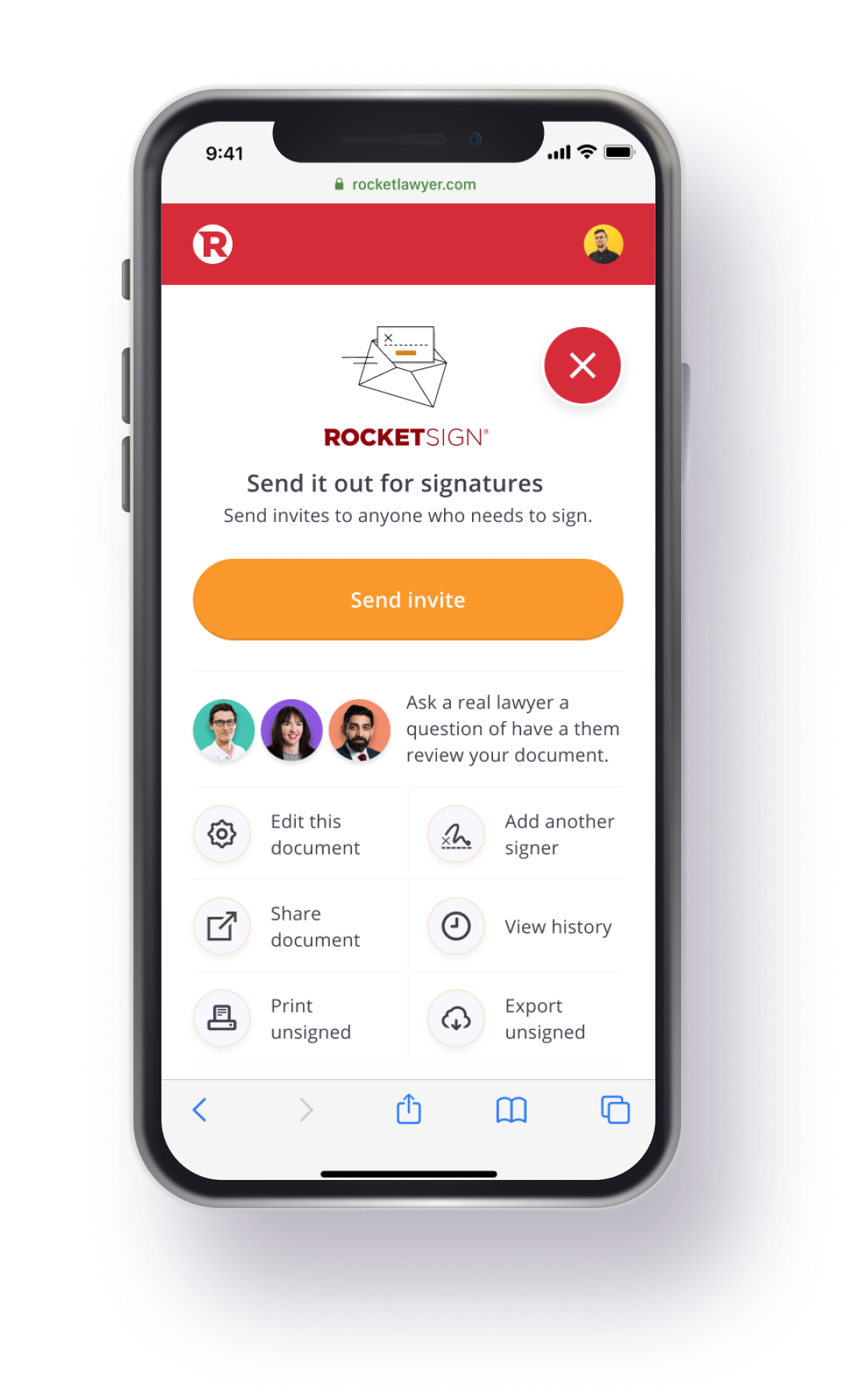
Joining Rocket Lawyer as a Senior Product Designer in 2019, my role within the innovation team was to design and build features and products to increase customer engagement and lifetime revenue. My first project was RocketSign®: the company's novel electronic signature product, which was recognised as a key reason for customer churn.
Understanding the problem
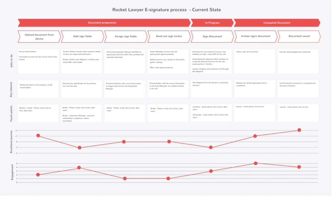
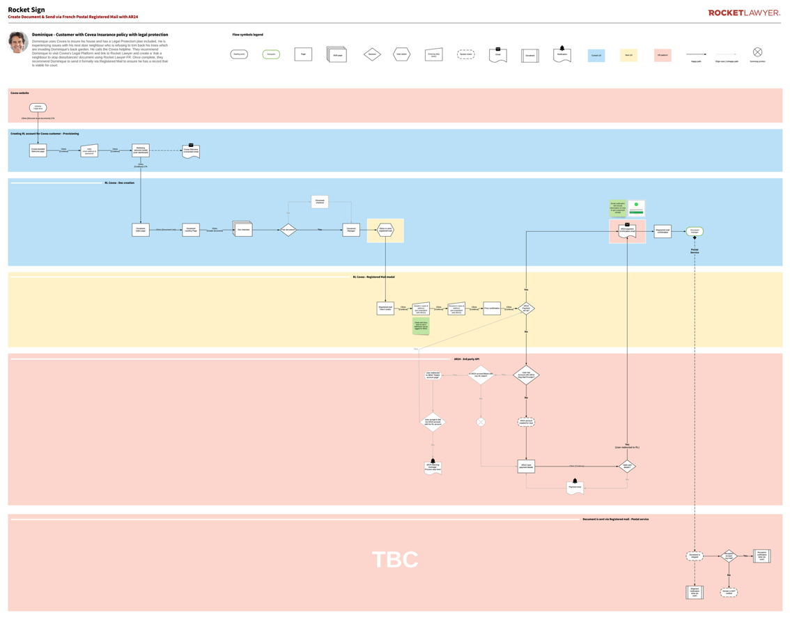
To understand the issues at hand, I led workshops involving stakeholders from leadership, product engineering, and the customer service teams, and set up an online community of SMB 'power users'. This led to the creation of service blueprints and journey maps, documenting friction points, opportunities for improvement, and areas of concern. Competitive landscape research helped me establish best practices and differentiate our product from other e-sign experiences.
Removing barriers to sign
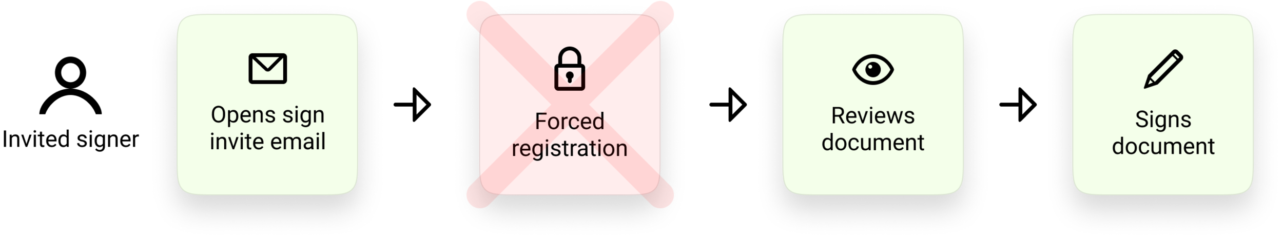
Through journey mapping, a significant friction point emerged – the requirement for people to sign up for a free Rocket Lawyer account (including card details) before they could sign a document, which was leading to a high drop-off rate. I conducted a series of experiments to build a data-driven case for removing this barrier, which upon implementation, led to an immediate uplift in sign completion.
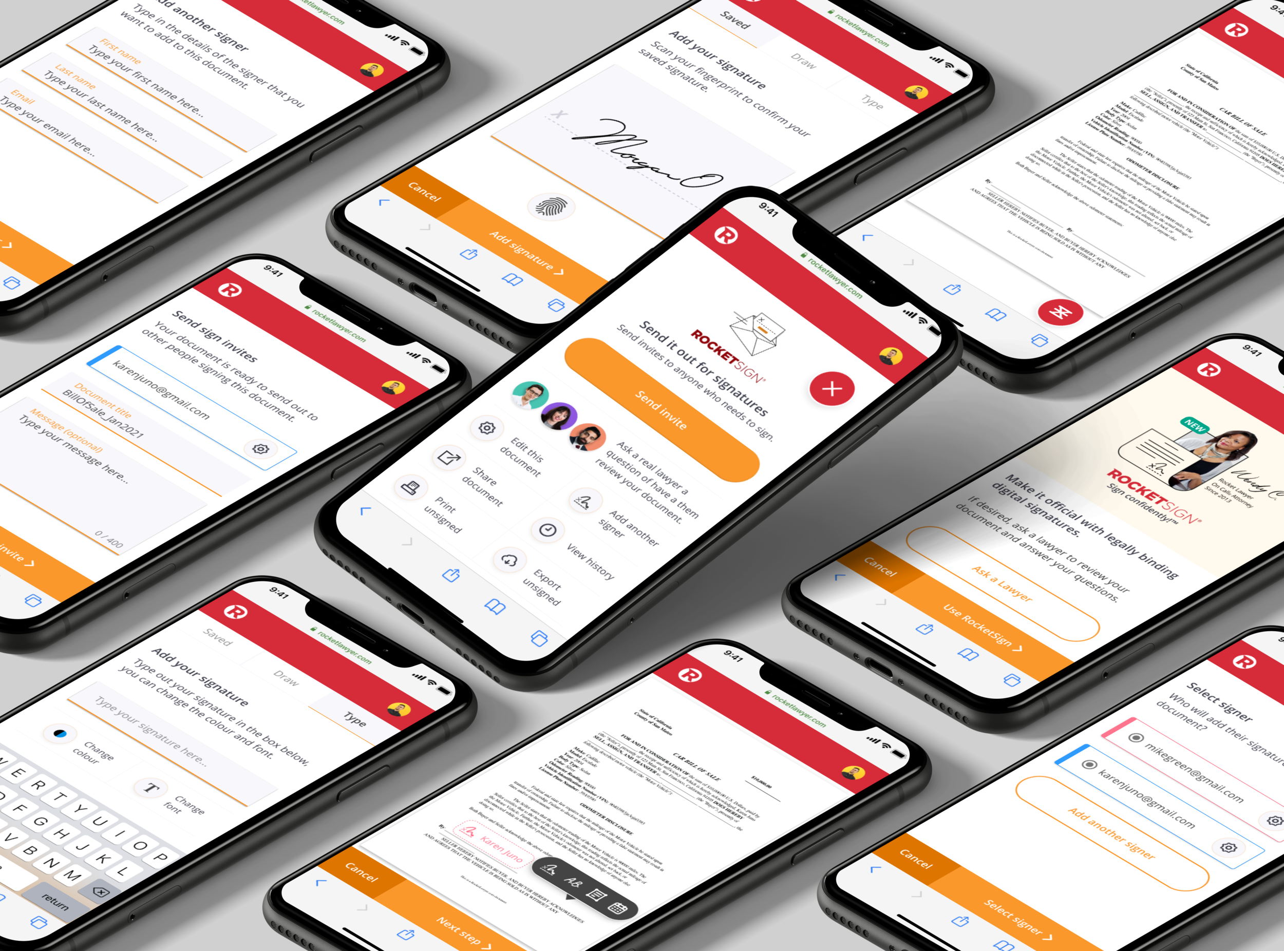
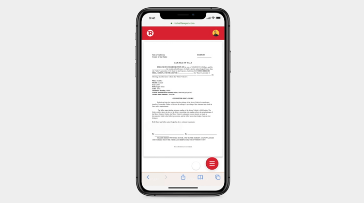
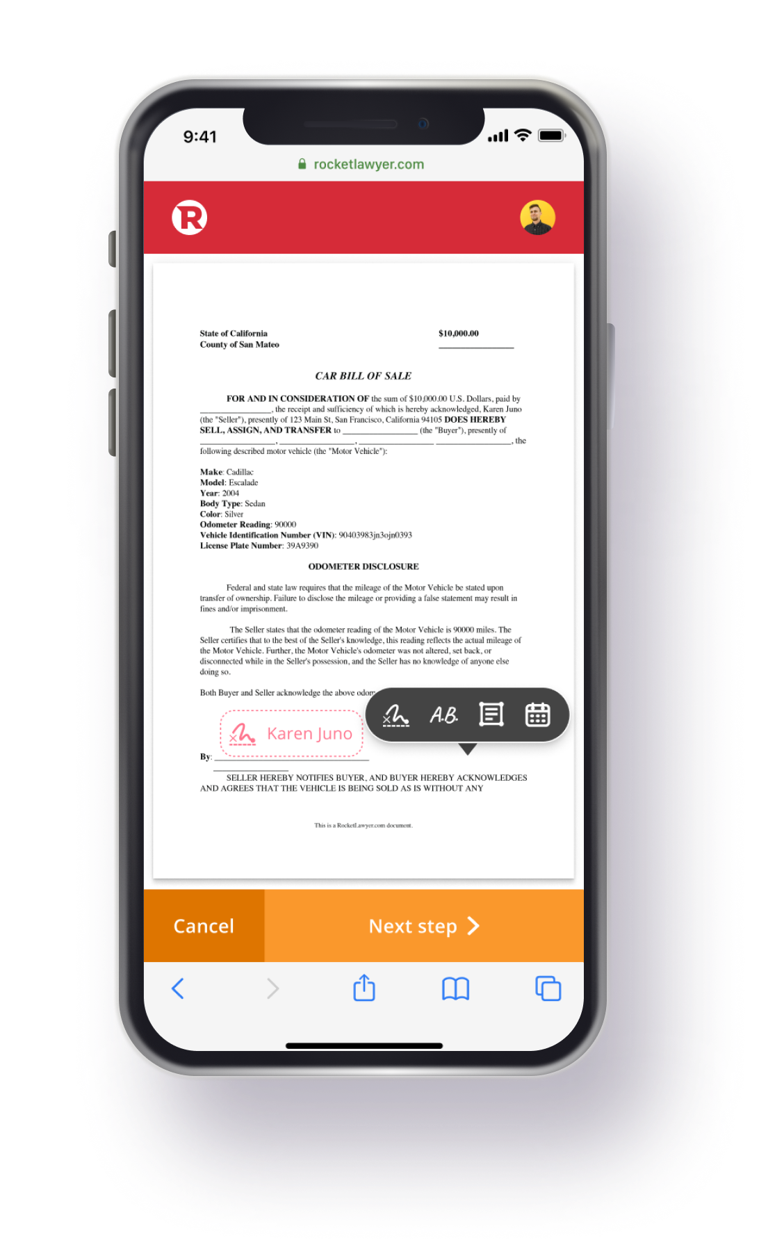
Designing for mobile web
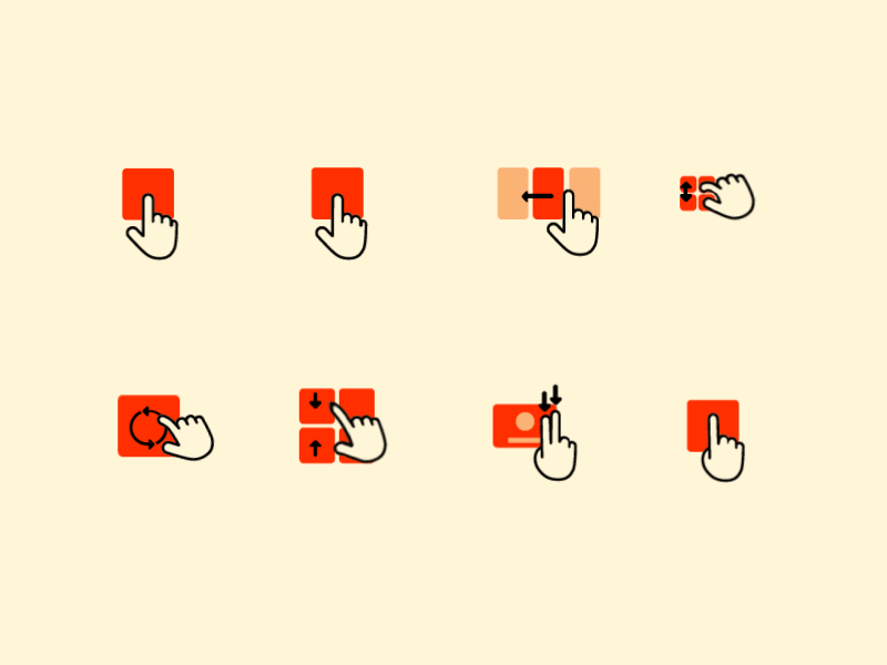
Customer interactions revealed that while SMB owners created their documents on desktops, their clients preferred signing on mobile devices. The current non-responsive e-sign tool was causing frustrations and abandonment. Designing an e-sign experience for mobile web presented unique challenges, compelling creative thinking and prioritisation of critical gestures.
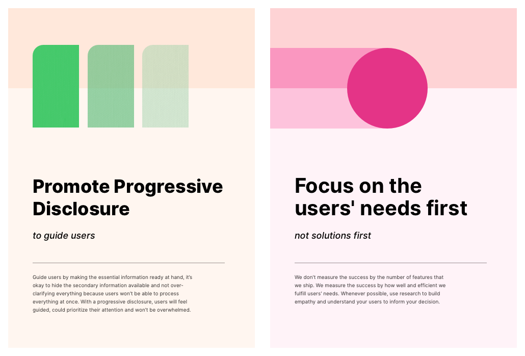
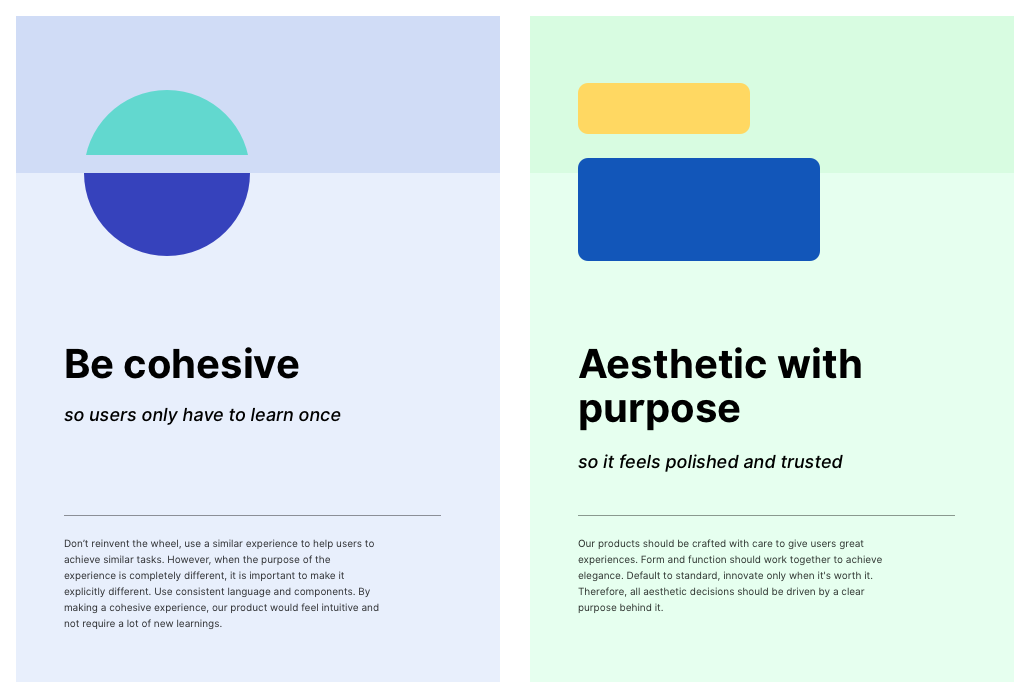
Defining product principles
At the design phase's onset, I facilitated a workshop with key stakeholders to define and prioritise product principles, which served as guiding pillars throughout the design process.
Desirability, feasibility & viability
Before embarking on the design, I validated the high-level solution via user flows. This confirmed that the issues being addressed were significant (by engaging with the SMB user community), made business sense (by consulting business stakeholders), and were buildable (by communicating with engineering stakeholders).
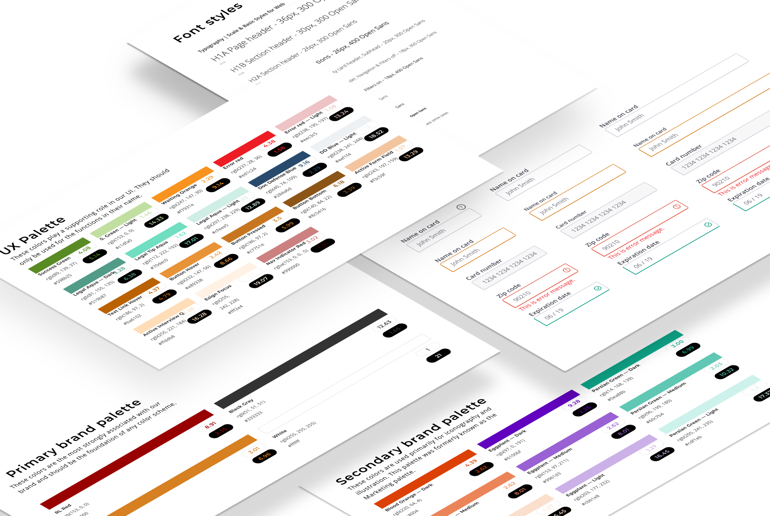
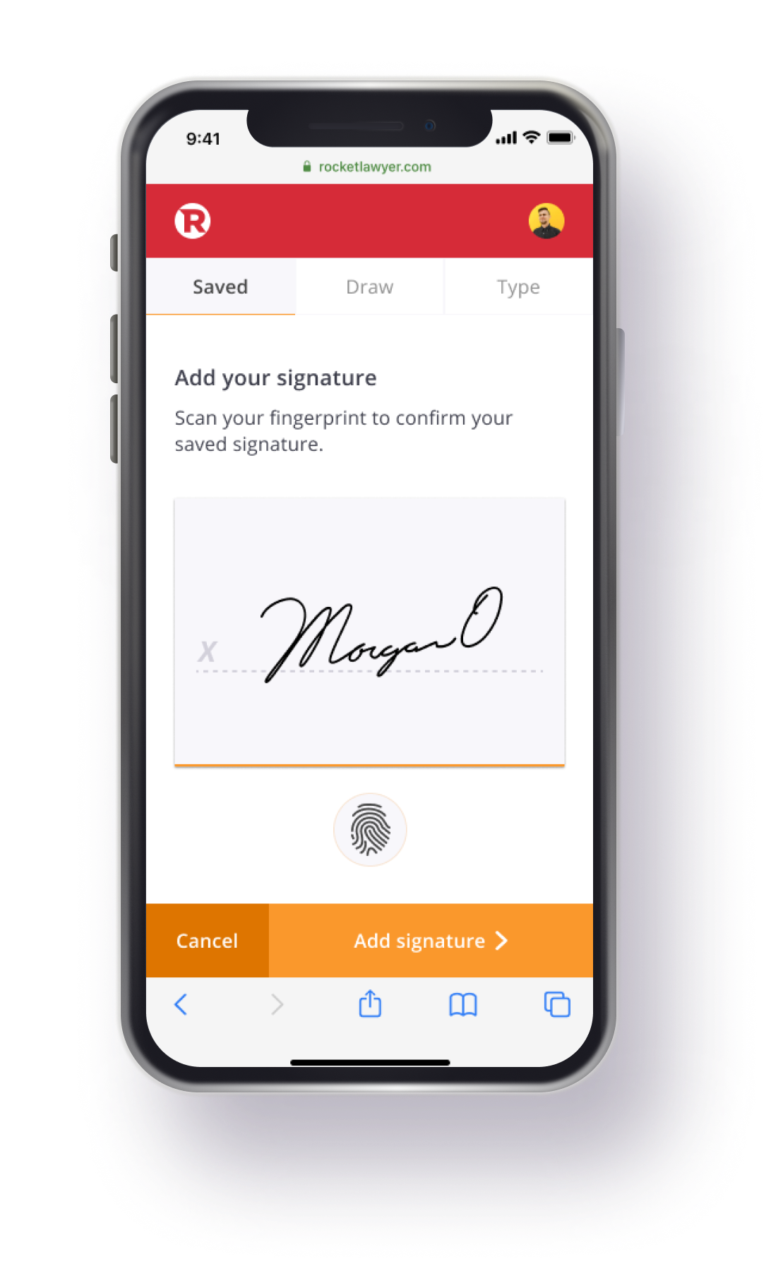
Atoms, molecules and organisms
With a limited design system in place and many outdated elements, I steered the design team towards an Atomic design methodology. This improved consistency and facilitated more efficient design iteration. I emphasised accessibility, focusing on colour contrast, click targets, and focus.
Quick and dirty prototyping
Looking at competitors in the e-sign space, I experimented with a system that enabled users to drag and drop signature fields onto their document from a toolbar. I created a quick prototype to validate this approach, collaborating with a front-end engineer to make a wizard of Oz prototype and conducting user tests with the internal team.
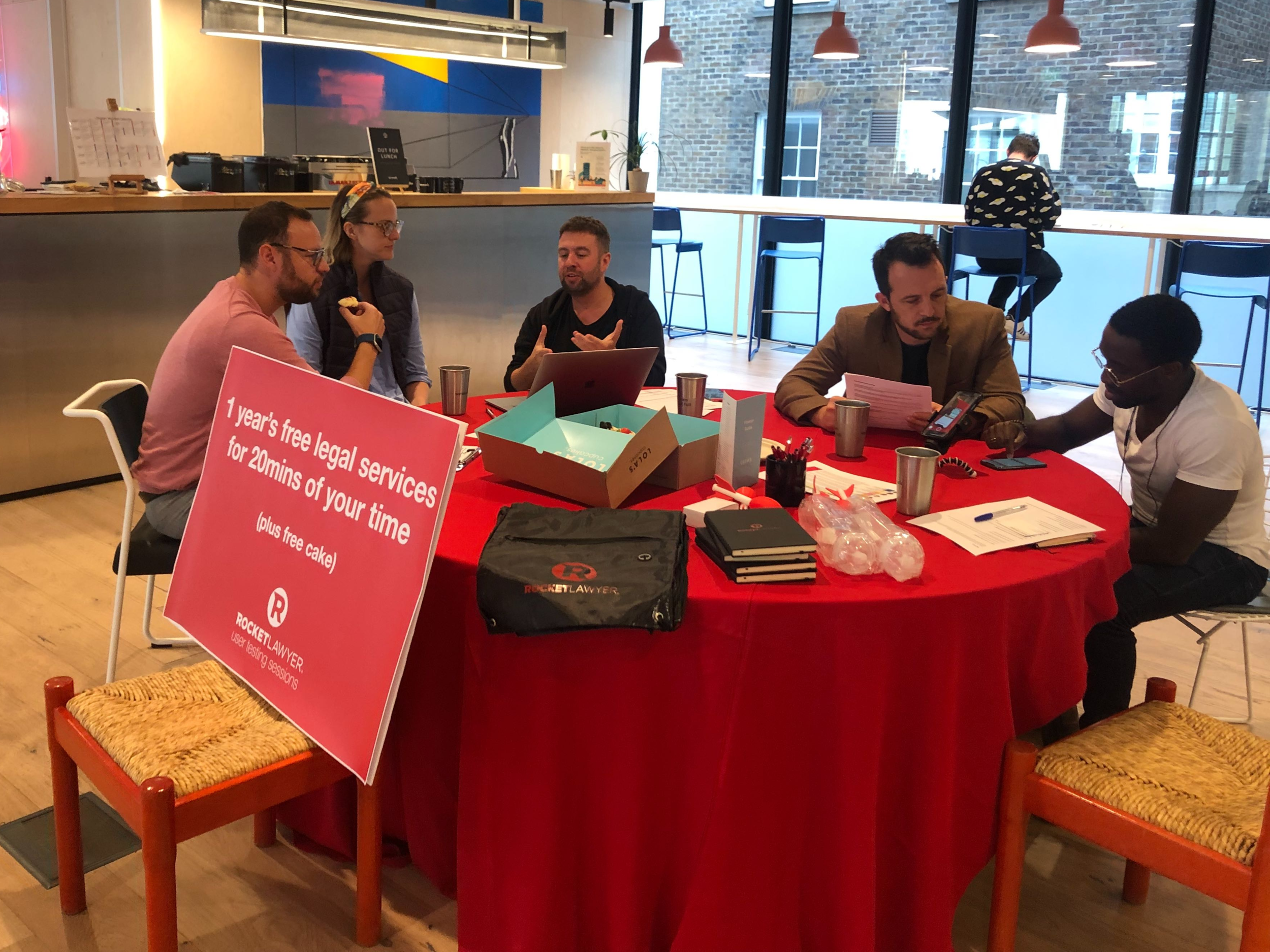
Hacking user testing
To get unbiased feedback from SMB owners, I approached shared working spaces surrounding our Shoreditch office, and managed to conduct six sessions with 40 business owners. In return for their time, we provided a year's free membership to Rocket Lawyer and some goodies. Nothing beats firsthand observation of users interacting with your prototype in ways you never anticipated.
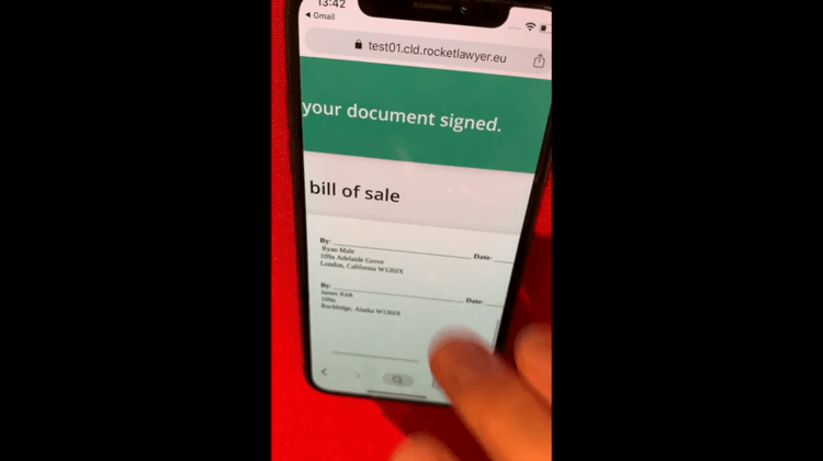
Video taken from user testing sessions
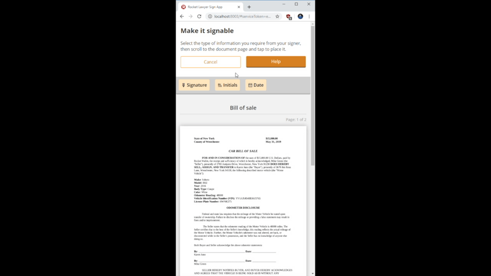
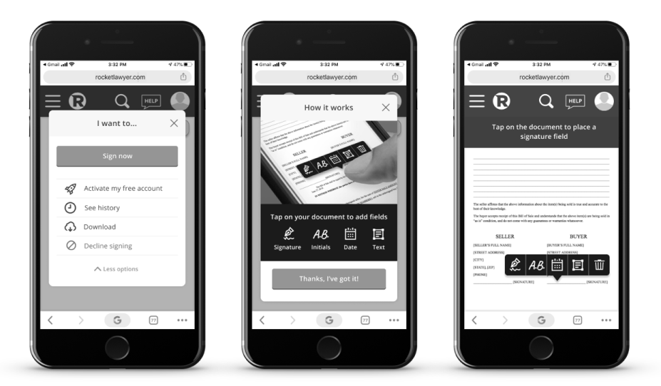
Tap-to-place design iteration
Iterating from feedback
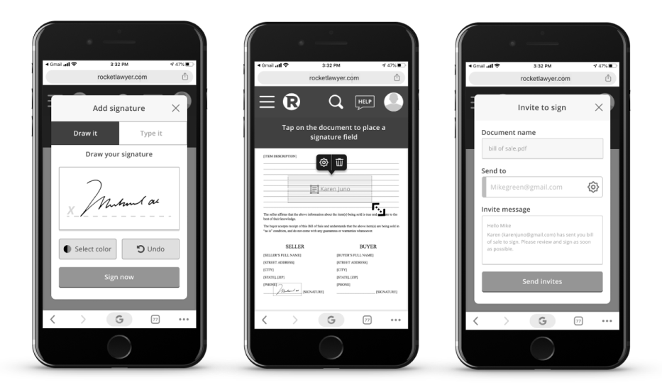
The in-person sessions were incredibly valuable and led to significant product iterations. The drag-and-drop system wasn't resonating with users; observing them interact with the prototype showed they preferred tapping directly onto a document to drop a sign field. Inspired by design tools like Photoshop and Figma, I developed a tap-to-place toolbar system, which was more intuitive for users.
End-to-end UX
Data driven roadmap
I instituted a customer feedback loop throughout the product design lifecycle through regular surveys and video call interviews. These data points guided the prioritisation of features during the product's full rollout.
Results
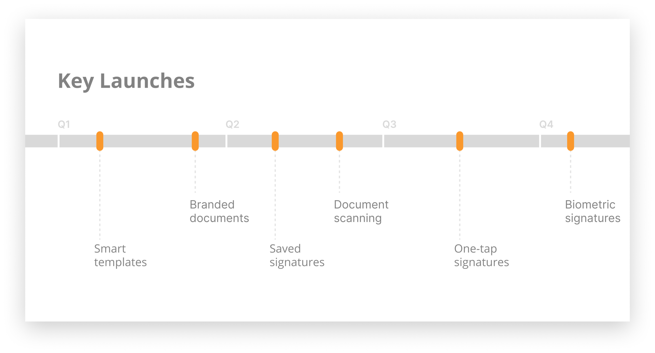
As of writing this case study, the new RocketSign experience is live on 50% of all US-based member accounts, with plans for a full rollout in the next three months. The business has reported a 16% decrease in SMB customers citing e-sign as a reason for canceling their subscriptions, and they project a 2% increase in MMR (monthly recurring revenue) post full rollout, equivalent to $133,000 per month.